Pages

Showing posts with label 30 days to get your art on. Show all posts

Sunday, July 31, 2011

Collaging Joni Circles

~"Circle Game" atc I made for Paper Traders monthly yahoo group lottery~
You may or may not be familiar with the music of songwriter Joni Mitchell, but I sure am. She was as much a part of my coming-of-age in the Sixties and Seventies as anything else. I have always loved listening to her musical poetry of words.

So, when I received my latest issue of Technique Junkies newsletter and saw the Collaged Circles technique, I also thought of Joni's song, Circle Game, and I knew I wanted to use a bit of those lyrics on whatever it was that I made. Here's a really nice live performance of the song, from 1967, with all of that rawness and non polish that makes those times and their talents so special, at least for me.

Make sure you hear the story she tells at the beginning!


The lyrics of the chorus, from which I took part of them as my sentiment (bolded), are here:

And the seasons they go round and round
And the painted ponies go up and down
We're captive on the carousel of time
We can't return we can only look
Behind from where we came
And go round and round and round
In the circle game.

Now, did you hear her story? She is talking about my all-time favorite musical artist, Neil Young. Exactly 40 years ago, I discovered them both as a fresh-faced sheltered 15 year old. They were my first leap into adult music, from my previous teeny bopper world of The (pre-psychedelic) Beatles, The Monkees, The Cowsills and Herman's Hermits. Back then, I always wanted Neil and Joni to fall in love, get married, perform together and make beautiful music happily ever after. Haha. Now, much older and wiser, I'm really glad they became best buds and lifelong friends instead.

And they are both Canadians. Why is it that so many of my favorite artists (Norma Shearer, Mike Myers, Alanis Morisette) are from there? I have a good guess as to why, based on spending several hours in a layover at the Ottowa Airport in 2004: Canadian people are fantastically friendly and kind. And the people online that I know who are Canadian are as well. They also seem to be very serious about being authentic and real. I'd say that describes Joni and Neil, too. 

I do have to wonder, though, what is in the water up there that makes for such awesome poet song writers...

It is on my bucket list to one day visit Canada. Perhaps I'll find out if I ever get there.

Thursday, July 28, 2011

Copy Cat Fun

Card front, featuring see-thru window cut-out and River City Rubber Works stamps
 A couple of years ago, I received a card in a swap that looked almost exactly identical to this one I am sharing today. That's because I tried to copycat it as much as I could, even using the same stamps. And it was fun to make.

Card inside, with finished window edges, really looks like a jail cell window, haha...I think!
I'd been so impressed with the card I'd received that I fell in love with the old ladies and checked out the stamp site, where I quickly discovered that this particular group of stamps was sold out or retired, forget which. So, I turned to ebay and luckily found them for sale. Back then I didn't think a blatant copy was an okay thing to do, and not being able to think of a different card design, I ended up not using the stamps at all. Until this week.

The design steps definitely benefitted from a well-thought-out gameplan, and even then, I almost messed up glueing the wrong sides a couple of times. I also had to think out the blacks on whites and vice versa, so I'm pretty proud of the construction. That's probably why it's so plain and simple, too. But, sadly, I cannot remember for the life of me who sent me that first card, so I cannot email her and ask. If you sent it to me, please email me and tell me, and I'll credit you gratefully. I haven't enjoyed constructing a card quite so much in a while, and whoever you are, I thank you!

Ain't it funny where inspiration, motivation, and all the other -ations come from sometimes? It makes life so enjoyable...those little things. Just like a true friend.

Tuesday, July 26, 2011

Carded

DCWV patterned paper, Papertrey digital sentiment stamp, Quickutz diecuts, KI Memories tags, SU card stock, Zig pigment markers
If you only knew how old all of the supplies on this card are! And, no packaged coordinating, all different manufacturers and brands. Yet, how well everything on the card goes together. The main thing I used to integrate it all was COLOR. In addition, I die cut shapes out of card stock that complimented the tagged elements I was already using. And I used the card base card stock color in order to anchor those elements visually. And because those elements tied into the others, it anchored everything.

Now, if I can just tap into this several more times...

As I describe, further down in this post, the dog days of summer are demanding strange things from all of us. I am not immune. In an effort to make my card making interesting and challenging, I pulled out all of my birthday text theme papers, all my birthday scrap elements and my tags and frames binder. My mission became to make as many cards as I can and use up as much of the stuff that I got out.

Back on July 8, I wrote this about how I had some greeting cards to make. After making some, I listed just the rest of the cards I needed for close friends and family for the remainder of the year: a total of a dozen, not counting any holidays. This was a few more than I'd thought, and I felt a bit deflated, like when you are prepared to clean the bathtub but then you realize that you have to clean the toilet first.

So, my Muse must have gotten her knickers all in a twist over it, because last night I began to feel her withdraw and by the time I awoke today, I didn't want to artify at all. Nada. Zero.

But, I am quite talented at making cards during periods of artistic motivational drought, also known around my place as a motivacay (as it's often the only vacay I get, haha). So, the short-term game plan for now is to crank as many of those suckers out as I can in order to get them done. And, wait patiently for my Muse to chillax or give me some kind of sign. Perhaps it's too hot to expect much else.

Friday, July 22, 2011

Gifting My Muse

Sometimes scraps are those old-school scrapbooking border strips...this time, from 2004!

You know, gifting someone else your unwanted or excess supplies is a great thing. But not when it is stuff so old that no one in their right mind, even on an especially charitable day, would possibly want.

In the world of scrapbooking supplies (which is the vast majority of my old stuff), old is not often cool old, as in vintage or retro. Most times, it's cutesy and it's what-was-I-thinking-when-I-bought-this. Sometimes, it was elements or stickers or other acutrements that matched the paper I just had to have. Occasionally, it came free with my purchases.

After 7 years, I've accumulated a pile of this stuff.  And it is an embarrassment to me to even consider gifting it to anyone else. I'm just not one of those who is willing to forward something on that would probably get thrown in the discard pile or worse, the pile to send on to someone else!

In fact, when I sit and ponder it objectively, I realize there have been more than a few times that I've taken what what was a seemingly impossible item and made it work somehow. It's not something that happens as a result of a scientifically scheduled experiment, easily replicated. No, there is some magic that has to occur. The time has to be right. The mood, the Muse, the music of creativity all have to be willing and awake.

But, it does happen. More than I really wanna admit. So, I go with it. I keep the stuff and try like hell to use it. And when I get the Ick vibe off a piece of it, I drop it in the trash like I'm not noticing. Somehow, doing this reconciles the cheapskate hoarder in me with the indulgent buyer and the recycler and the challenge-lover.

Basically, I like to think of it as Gifting My Muse. Keeping her honest and on her toes. Making her work for me. (yeah, right, haha) The only bad thing is the nagging whiney voice inside me who begs for nice new cool stuff to feed my Muse, as in, when am I gonna get to play with timely and currently cool things instead of all this old crap?

Sounds indulgent and ungrateful, but I hear myself think this way too much. What helps is to join a group of people who are struggling with the same thing. I'm in two such groups over at Art Journaling Ning: Cult of Stuff group and 30-Day Craft Cleanse.

I am actually able sometimes to tell that nagging, whiney voice to STFU. And that's worth its weight in old unused supplies, lemme tellya. winkwink ;-))

Tuesday, July 19, 2011

Art Imitating Life

I received my replacement ink set today from Dick Blick.
Lickety split!

This was my daily art: the process was index stamping and casing these alphabet stamps.


They have been waiting patiently to be entered into my system, and it may be even longer before any are actually used in some art. But I got a bit impulsive towards casing them because I had some notion about having them available in case there was space to art journal with them. I usually print out my text on a printer, but not because I prefer it. Mostly it is because all my stickers and stamp font letters are too large for the available page space. And with this go-around of art journaling, I'm not into handwriting quite yet. So, if I can know where there are some tiny alpha stamps, perhaps there will be space for use.

I'm working on the next page in my Little Gluebook of Wisdom, but there's been injuries. I'd found a cool word cloud graphic and cut it out all nice, but the paper was a thick magazine glossy and so I set about lightly sanding the back and I tore an edge of it right off. At first I wasn't gonna use it at all, then I thought, this is ridiculous. It's a personal experimental journal. So I decided on a compromise. I tore a few other edges off of it and that is now part of the message of the page. I even dampened it and crumbled it up, then smoothed back out. HA! Take that, Karma (she said cheerfully...and gratefully).

But I digress. If I do not finish the page tomorrow, I'll take some photos of my progress.

Monday, July 18, 2011

Life Moves Faster than Art

Well, here it is, finally finished: the journal page that took a week to finish, sheesh.

Guess I was taking the quote to heart, eh? Love this Ferris Buellar quote, and here is some trivia from the movie. Did you know that the actress who played Ferris' mom (Cindy Pickett) and the actor who played
his dad (Lyman Ward) fell in love on this movie and then got married in real life? True! Of course, they got divorced 6 years later, but that's Hollywood (and real life) for ya.

Still continuing to play around with my watermark brush in PSE (not knowing what the heck I'm doing when I do it, by the way). Somehow figured out how to make it more white so that I can stamp it on dark colors, and then saved it. So hopefully now I have one for light colors and one for dark colors. I stamped both on this journal page photo, can you see them?

Saturday, July 16, 2011

Process Over Product...

You know, I need to remember to respect the process of creating art as much or more than the product. I need to share my work in progress whenever I'm working on something instead of waiting until Lord knows when it is finally finished, I guess. Which, currently, would be this start on an art journal page in my Little Gluebook of Wisdom.
Four or five days ago I began with a cross-weave stroke watercolor wash, on top of which I couldn't wait to slap the colorful city traffic graphic image I found in one of my magazines. (And looky, I found my Art by Aimeslee Photoshop brush, hehe.) I took a photo, meaning to share. A photo taken in process helps me really look at it fresh, too.

Of course, the photo made me wish I had stamped some border stamps horizontally on the background before glueing on the image, so I did the next-best thing and masked the image off with scrap paper to  stamp.
Stamp by stamp, I created the horizontal lines I wanted. (Also, you will have to imagine more and more stamps, because I neglected to snap photos after every different one.)
This image is almost too colorful (never! hehe). It needed the lines to balance it on the page and in a way help it blend to the background more (if that were possible).
I love this recreation of a busy rainy night in Times Square, NYC. Love the yellows, the black, the touches of red, the dark blues.
Love how all the colors reflect on the street like they are mixing with the motor oils and rain and sludge.
Eventually, I added lines of border stamps across the entire length of the page. The stamp colors really anchor the reds and blues in the image. It's pretty much done, except for the quote, which I've chosen but haven't created in PSE and printed out yet.

That's yet another use for an in-process digital shot. I can size my quote text perfectly as a new layer on top of the above image, laying it out exactly as I want it to look, then print only that top layer. I got to where I was doing this a lot in Paint Shop Pro, but this will be my first time attempting it in PSE. I hope it's intuitive and easy enough for a beginner like me. Or I could go rogue and just add the quote digitally to share now and add a printed one later. I read in Claudine Helmuth's second book about heat tool transfers and I have really wanted to try out my heat tool doing that. If I printed the layer out backwards, I could do it.

Decisions, decisions.

Will share the finished product once I have one, but for now, here's the process.

Wednesday, July 13, 2011

Teen Time

~ Birthday card for my #2 nephew - the front ~
If you have read my blog for any real length of time, you may know that I have 4 nieces, but I also have 6 nephews. This abundance of boys has been a constant problem for me as a cardmaker once the recipient has become a teenager because I'm basically a girl mom.

It is hard for me and my Muse to get into the Testosterone Zone.

~ Inside the card: a little typical humor at 17 ~
So I resort to cheap jokes and wisecracks when nothing else hits me. Some of these are big hits with the boys. Some not so much, but since they are all pretty fine kids, I get nice compliments anyway. Just wanted to share that I used PSE9 to add the speech bubble and text.

Now that I've shared my card, I would like to talk about a couple of things. First, I want to sing this from the rooftops what happened to me today. I received an order I'd made with Dick Blick art supplies and upon opening it, I discovered that one of the products was leaking. I had ordered these:

Dr. Ph Martin Bombay India Inks Set #1

Dr. Ph Martin Bombay India Inks Set #2
Now, here is what set #2 looked like when it arrived:
All that permanent ink was luckily coming from only one bottle, Cherry Red:
So, because I'm a long long time mail orderer and am loathe to have to ever return something (since I probably scored a deal with free shipping and a sale price), my first thought was, okay, looks like a lot of ink leaked, but it really wasn't that much and I'll just eat it, clean it up and go on with life.

But then I opened the bottle and used the eye dropper. It was then that I discovered that a malfunction or damage to the dropper gasket was causing the leak (and I have the cherry red fingers to prove it! hehe).

So, the dreaded call to customer service could not be avoided. I was thinking that I'd just ask them to send me another bottle of cherry red, right?
Got on the phone. Talked to a delightful representative, who looked up my order and the item, and then helped me navigate to the internet product page while we were talking. She explained that they did not carry that particular color in open stock, but maybe I might like to pick a red shade from the open stock they do carry.

So, I look, and every shade of red in open stock is also in the 2 sets I purchased. Hmm. I really had not thought past just getting another bottle of cherry red. I was just kinda bummed, bummed and ambiguous.

Then, she said, "We'll just send you a replacement set and you won't need to return the first one."

WHAT????

It's a $33.00 set. I think I even replied that I felt guilty now, it shocked me so. I resisted a bit, repeating that I only want one bottle. It was like I was in shock a little. It must have amused the nice lady. I heard a little cheer and reassuring in her voice. Of course, I promised her my first born grandchild as a token of my gratitude.

So, why am I telling this? It's simple. There truly are some companies out there who stand by their products, their service, and their promises. Dick Blick is definitely one of them. For the first few years that I did art, I really resisted shopping Blick, partly because so many others used them and you know me and lemming behavior. Also because they charged shipping and I actively sought out free shipping deals that did not require me to spend alot.

But finally I encountered an art supply I needed badly and could not get elsewhere. It was then that I looked around their site, compared their prices to what I was paying elsewhere, and literally added up how much more I could save with Blick even paying them shipping. The difference in most prices compared to Hobby Lobby, for instance, blows my mind sometimes. Dick Blick sells a 12-(1 0z.) bottle set for $33.18. Hobby Lobby sells a 12-(1/2 oz.) bottle set for $29.99. Dang, almost twice the price at HL! Open-stock 1 oz bottles are $2.73 at Blick; $3.99 at HL. And it is that way in most every category of items they both sell. You can clearly see how after 5 or 6 items you are paying for the shipping in product cost savings, right? Or, hey, after ONE ink set in my example.

So, no one is compensating me for my testimony today. I just wanted to praise an awesome company and give a specific example of their great customer service. They are not alone, so I really do need to remember to mention the other great companies I've dealt with as well.

Monday, July 11, 2011

Life Imitating Art...

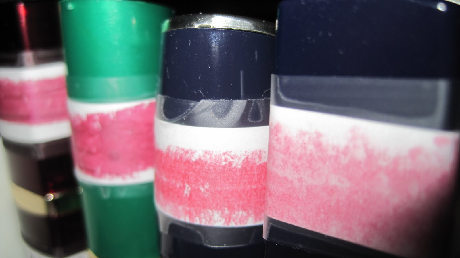
Some call cosmetics "art supplies for the face".
So, is it so wrong to label them?
I find it odd that something (cosmetics) that is needed much more so as we age is labelled with words so tiny that no one a day over 30 can read them. And only some of them give any indication at all on the outside what color or shade is inside. To me, this is a consumer item just screaming to be labelled, if for no other reason than to give my tired old eyeballs and my magnifying glass a rest!
So, that's exactly what I did. But not before I tried on some. :-)
I googled, found and used a photo booth strip template for PSE from this nice lady, who asks only for a link back, so there it is. Now, I am going to assume that because I'm a pretty total dumb-ass when it comes to PSE that I'm at fault here, but I must have needed a more idiot-proof template because I was tres frustrated in how difficult this was to use (again, for my apparent (pre?)beginner level of knowledge).

Beggars can't be choosers when it comes to free, but I would gladly pay for one that lets you just drag n drop and the template resizes your photos to fit into the frames. I finally figured out how to measure each frame interior space, then resize and crop each photo to fit, then dragged n dropped, and still had to stretch one or the other dimension to get a good tight consistent fit.

I am thinking of emailing Michelle at Cottage Arts (or ScrapbookPATTY, are you reading?), because I would pay good money for a digital hybrid package that works in PSE9, that has templates that let you do stuff like this strip the way I want it, and more. I've amassed a nice wish list, and I'm not alone in my needs. I would help whoever created this market it for free, that is how much I need this. Maybe...Probably, someone has already created it and it's selling off the wall somewhere, but it might as well be selling on Mars because I do not know about it.

For example, I have a Epson Picturemate printer that I LOVE to use. It only prints 4x6, but it prints much better photos than any photo that my ink jet printer can print, and cheaper. And, that size is fine with me, because on a 4x6 canvas, I could print 2-2x3 wallets, or 12-2x2's, or 2-2x3 horizontal strips, and on and on. All perfect for paper scrap booking in either mini or full formats and in art journaling (all of which I do, non-digitally, maybe at most, hybrid-ly). As it is, I have to struggle to do this myself in PSE using a 4x6 document. And I know I'm not doing it right, because it only prints right in Windows (but thank gawsh it prints there).

I'd also add that I also prefer having large amounts of photos developed by mail, so the Picturemate is mainly for photos needed asap and for the smaller photos.

This past winter I finally quit my 10-year addiction to PaintShopPro, because the newest version kept freezing up my computer. It was like the last straw. I'd learned how to do these kinds of things in PSP, but it's just different enough in PSE to confound me. (Although I should add in fairness that it runs so wonderfully on my computer, and what good is any program that doesn't?) There are many things I love in PSE, mainly that Move tool. And the brush tool rocks (except that I suddenly now cannot find the Art by Aimeslee watermark brush I made...deep breath, I'll find it).

At any rate, it will take me a year to do it on my own, which is why I am willing to pay for someone else to. I even paid like $60 bucks back in the spring to take Kim Klassen's PSE course. I got almost through it and then got terribly lost and confused (my fault entirely). I may have to end up paying to take it again before it's all over, but for now I am doing her free mini course first (which began this week). And I'm planning to take every free thing I can find, including over at Elements User village since I recently subscribed to their magazine.

But I would love to be able to print out some little photos NOW without getting all stressed out and failing. I guess I can always pay Walgreens or Snapfish or Winkflash for more wallets than I need (wish you could mix and match single photos on those), or I can always just waste photo paper at home printing a 2x2 on a 4x6, etc., but that's only gonna solve one of my wish list wants.

Another big thing is to be able to buy overlays for my photos that do the same things as the ones on the iPhone. The Hipstamatic things, like the ones Sally uses on her photos she shares on her blog. Look, one of my mottos has always been *never say never*, but this comes pretty close to an exception: you are probably not ever gonna see me using an iPhone, as long as there is the kinda choice there is now. And that is another story as to why, but bottom line is, I like those app overlays (that is how I see them in my feeble mind cuz I see Kim Klassen doing the same thing with overlays).

Surely someone is making them for PSE, but I need the 411 locationlocationlocation. I also need translation, too, like "Compares to Hipstamatic" -- some way for me to know that it does what that does. I'm not hip to the lingo, and I don't ask my Missy because she'll just look down her nose at me and suggest I just go all Apple, and I'm not, so that won't be helpful.

In fact, I'm suddenly not having fun with anymore, as I am beginning to be pestered by a cartoon of myself as an old hag who cannot see, wears too much makeup and can no longer operate computer programs or shop online. Meh.
Wow, so how did I get off on this tangent, haha? Thank gawsh it's all just Life Imitating Art! wink wink

Saturday, July 9, 2011

Birthday card share

Missy's birthday card made from scrap scraps scraps...
With our daughter Missy turning 23 this week, the Hubster and I have really felt our ages a bit. I don't exactly know what we were thinking before, but we apparently had been delaying the fact in our minds that Miss was indeed an adult. Tis one thing to say it, and another to feel it.
Inside sentiment - written by moi. :-)
She has a very demanding job that doesn't pay that great, and after a year of singing that song, it has contributed to some disillusionment and reassessing on her part.
Against the backdrop of the worst recession in my lifetime, she has had some tough soul-searching about her choice of profession and her future in it.
Of course, I'm now a bit terrified for her. Is she making the right decision?
And I am feeling pretty helpless, for she is the only one who can know the answers. After all, it is her life.
What she is going through isn't new or novel. Most young adults, after being thrust, with college degree in hand, into the real world, encounter that big let-down, when what they've imagined their work to be is indeed something entirely different. In Missy's case, she has weathered discovering how mundane and boring part so fit are, and if they paid her decently, she's be pretty satsfied where she is, where they love her work and trust her with responsibility and relative security.

On one hand, she is lucky. On the other hand, it makes it worse because the one thing they cannot, do not reward her with may well be the one thing she discovers is her prime motivator or necessary requirement. Hubs and I have been concerned the last few months because she has not been herself. It's as if all the enjoyment of life in her was being sucked out. I pray daily that she can figure out what really will make her happy and that she won't regret whatever she decides. But I also know she cannot go on the way she's been. Something has to give.

There was a recent study I read about that looked at young professionals her age (24 and younger), and it said that in the last year 44% of them have quit their jobs. Now, most would assume that means that "kids" that age are just lazy or immature and if things don't go 100% their way, they are outta there. But, in fact, the study reveals that the reason is because these "kids" are being worked to death for low pay by their companies who see this as an okay way to weather the recession (whether the companies are being adversely affected or not).

In other words, the times allow companies to get away with treating the youngest in the work force that way.

Most of my daughter's friends that I know are worth thinking much better of, and are worth treating better. I just hope and pray that things improve before any real psychological damage is done to their generation. I think they are all pretty much great kids and deserve better. And we need them to help us fix what is wrong with this country. And we need them to want to.

Friday, July 8, 2011

My Home is Not...

For today's 30/30/30 challenge and collage class warm-up play, I give you "Home is Not a Place". I used a page in my Little Gluebook of Wisdom that had been painted sky blue long ago, adding bits and scraps I've had laying around. I love this quote and wanted to represent the people as almost ghostly spirits. I'm finding my little Quickutz dies a convenient way to make shapes I do not already have in my images. On this page I made the clouds, door hinges and the fence with them.

This is my third art journaling page in as many days. And I'm both immensely proud of myself and a bit whiny for a break. So, I'll be taking the weekend off from them, but not from all art. I've a few greeting cards to make. Hopefully I can muster enough discipline and focus.

Yesterday was our Missy's 23rd birthday and we all celebrated at a favorite restaurant. I will share the card I made for her in Saturday's post.

In neighborhood news, *our* dang ducks have laid another nest of eggs in our front flower bed. Hubs is too busy teasing our neighbor across the street to be irritated about it this time around. She is getting tired of putting out food and keeping the baby pool clean and watered, but Hubs will not let her forget that she was the one who encouraged the ducks to stick around and be fed and watered. He could not wait to tell her about the new nest. I try to stay out of it, because all I know is that I'm not feeding them, yet I understand why she does. Anyway, we are expecting more ducks next month.

We also had a pretty stress-filled evening last week. Thank goodness that Hubs had just gotten home from work. I walked out to the garage and began hearing wind chimes, but it was surreal. Not only was there no breeze in the garage, the chimes were ringing constantly. At first, all I could think of was, this sound makes no sense.
Then I remembered the wind chimes that Hubs had hung up in the garage when he painted the exterior house trim last year (and forgot to hang back outside). I was stuck on stupid about there being no breeze when I snapped to actually looking at the chimes, whereupon I spied this huge-ass snake all tangled up in them.
Poor Hubs was summoned and beseeched to practice his hunting skills, which he did, succeeding finally in rooting out the shy reptile, who tried to escape by visiting 3 corners of the garage before Hubs finally chopped off his head. At one point, it came out slithering right towards me, all 5 feet of him, and all I could do was stay frozen to my spot. Some brave heart I am! Anyway, it was a rat snake and non-poisonous, so that made me feel better about pushing Hubs into the path of danger. Needless to say, our blood pressures were up for awhile that evening. Five feet of anything inhuman is too big to hide in my garage without my permission!

Wednesday, July 6, 2011

I am what I am...

Left-facing journal page to yesterday's page, in my Little Gluebook of Wisdom journal.
The page I share today was created with inspiration from the lessons I am reading in the Your Vintage Gluebook class I am taking. I probably should confess that with all the classes I am taking, I'm approaching them like I would audit a class. I don't necessarily do the *homework* or assignments in a literal sense. Instead, I ingest the curriculum and what I learn from it is in whatever art I create.

Vintage is not my natural style, so it may seem weird or odd that I would choose two classes that emphasize it. What studying Vintage collage does for me is that it forces me to calm down and simplify my own style. My vintage pieces are always going to be more colorful than the traditional, because color is my art oxygen. But that's okay because it is me.

In doing this page, I discovered a tip for covering up gluedots under vellum -- gelpen or viva decor pen little dots of color on top of the vellum where each gluedot is! For years I have wished for an easy way to conceal them. When the style allows, this idea is easily implemented and adds interest, too. In the future, I will add my gelpen dots to the front of the vellum first. If they need to be linear and neat, this is easily accomplished with a ruler or stitching template. Then, I have a perfect guide for where to apply the gluedots on the back, all hidden.

Now, a word about the balance of my design. This was one of those pages that was begun with some papers that color-complemented the facing page, a couple of quotes and the collage sheet image of the woman (by  Digital Collage Sheets from my stash). As I read more of Mary's lessons, I chose some german scrap pieces in various sizes to add. But the design of this facing page needed to complement the first page as well as stand on its own. So it took me a while, arranging the elements. I finally decided this layout was pleasing enough and did justice enough to eye movement, color distribution, and proportion. And when you see the entire spread, it is pleasing to the eye as well as sensical. Score! If not a superior mark, then a passing grade, certainly. Here, I merged the two in PSE for you to see:
This is what the spread open in my journal looks like.
This is also my 30/30/30 challenge for today.

Tuesday, July 5, 2011

Warm-Up Week

Page in my Little Gluebook of Wisdom journal,
 inspired by a collage by Claudine Helmuth found on page 62 of her first Collage Discovery Workshop book...
Whew, I feel like I have a heavy load of tat lifted off my shoulders tonite! I'd secretly been fearing that I no longer had it, meaning that because I've taken such a break from art journaling and collage, I'd lost whatever talent/skill improvements that I'd fought hard to acquire. But I have discovered that it's more like riding a bike (it comes back to you), and for that I am very grateful.

Okay, briefly, the black page base is w/c crayon spread with a baby wipe, then a rainbow-colored layer that is a recycled privacy envelope that I pan-watercolored, then collaged elements, and my digital signature watermark brush that I'm pleased as punch to have figured out how to do in PSE9.

I know it has been so long since I was regularly art journaling, so to review, I have several art journals in progress. My Little Gluebook of Wisdom journal is a composition notebook holding favorite quotations. Then, I have a couple of what I call play journals, where I have played with different materials and techniques to create backgrounds, and I will probably try to finish all the pages in those before doing anything else with them. My journal, Wake Me When It's Over, began as a place to put some of my musings about life. I have a genealogy journal, and then almost a dozen other books and blank journals waiting to be altered. In addition, I have sheets and sheets of 140# watercolor paper, a Bind It All, and book binding materials, just in case I want to create my own journal.

So, I have plenty to work with. And now since I am collaging this summer, what better place than in my art journals? Due to present physical circumstances with the ill-fated art table move delay, backgrounds with acrylic paint and gesso are very inconvenient for me. So, I have devised a game plan for now using watercolor pencils and crayons to lay down simple backgrounds on which to collage. I am almost excited to see how long I can go with that idea.


In addition to Claudine's class (see July 3rd blog entry), I'm now signed up for a second self-paced class, by Mary Green of GreenPaper. And I have joined a free layers workshop over on ArtJournaling ning taught by Samantha Kira aka JournalGirl. Finally, art journaler artist Traci Bonkers is hosting a 30/30/30 challenge on her blog for July called 30 Days To Get Your Art On. I'm tempted to participate, but knowing myself well it will not be every day, wink wink. Geebus, I'll have so many places to post my pages, I might start to feel like one of those card makers who make one single card that fits 10 challenges or something!

This is just a small sample of what is out there to inspire and motivate art journaling, trust me. But, I'll be praying that just a bit of it rubs off on me, because I really am enjoying it. And I'll have another genre of new art to share besides greeting cards and atc's!

Sunday, July 3, 2011

Hooked on a feeling

I've had BJ Thomas singing in my head all day, so I thought the least I could do is to spread the love!
Ha Ha Ha - Don't be hatin' now!    wink wink

Seriously, I have been such a good girl photo organizing for my Finding Photo Freedom class. It's just that, with over 5,000 photos on my computer and over 5,000 more waiting to be scanned in, it's highly repetitious and becomes body and soul numbing after a while.

So, to get my mind off photos file management FOR AWHILE, there was an opportunity to get a class with the great Claudine Helmuth for only $30 and I jumped at it: Composition for Collage.

What was the first thing I did? Read the syllabus? Heck, no. I read both of her books finally, having had them both on the shelf for years.  (My recognition of her predates her merchandising career with Ranger.) I just knew the class would cover things from the books. Nope. All new stuff, yet quite relevant and useful. Plus, a bunch of her signature collage images to download.
Available here
Not easily convinced and armed with the knowledge of what is covered in the class, I read the books carefully, looking for keywords such as vignette, horizon, grid, even symmetrical and asymmetrical. There was no mention of those particular tenants of composition, and I came away being left with the idea that the books were helpful as precursors or prep courses for learning those tenants. She used a similar visual method to teach *what looks right* in the books, as in the class, but in a completely different and more general way. I thought that was cool, and it did help me to feel good about tackling the more complicated constructs, in a way similar to how one feels when they review basic rules about a discipline they may be quite proficient in, now understood in a deeper, more satisfying way.

Taking this further, while reading the books, I gained a deeper understanding of what she taught in the class. I found myself looking at the various collage art samples, identifying them as the specific examples class-taught. I'm trying not to get too specific, as I don't feel right disclosing too many details of what's in a non-free class, but most of it was new info to me. (I'm not counting hearing about them in college art class...that was 35 years ago and I was not that attentive at the point due to a soon-to-be defection to accounting).

I am enjoying her approach now though. Mixing that little bit of academics in with clear examples makes the most of ideas that are easily packaged in the mind and remembered. And identifying examples in the books built on that. I even noticed one or two that I thought would have looked better had they been another collage design. Whether my thought was expert or not (and it isn't) does not matter here. What matters is that I took it further and ventured to apply my new found knowledge (whether I possess any appropriate skill will be decided once I actually create my collages).

I must disclose that the live version of the class ended June 30th (it isn't over, though; it can be purchased at any time as a self-paced class, and is forever accessible). Due to my Arthur flares and a little much-needed stacay, and then an annoying and exhausting digestive thing that infected both me and Hubs, I am just now doing the class. It was when I was flaring or IBS'ing that I read the books. Now, I am ready to rock n roll, and make some collages. I have one almost finished, so I promise it for next time.

Til then, I will leave you with today's art share, an atc that I made for the monthly lottery in my Paper Trader yahoo group:
I am trying to participate in this group in some way, and so I do the monthly atc and say this with the understanding that I don't have a lot of time to devote to it (because they have lots of other wonderful activities if I had more time). But... if I did this atc over again, I would have adhered a stiff base (hard plastic packaging plastic or cereal boxing?) to the back of the focal image before adhering to the corrugated cardboard, in order to avoid transferring the lines. They bug me. Another time, I might have thought ahead, but water under the bridge. Oh well. This was an image from some old scrap booking card stock scraps, and the corrugated piece was really what I wanted to work with (it was a whim).  I would also have remembered my little craft container drawer full of spiral rings instead of hunting through the junk drawer and my beading drawers for large rings. But then I wouldn't have seen the charm. Vox nix, I guess.